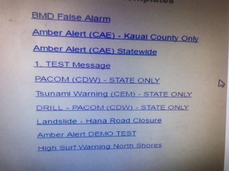
It’s not everyday that an User Interface problem makes waves in the news. When Honolulu Civil Beat posted a screenshot of the interface behind the false emergency alert, it became laughable how one wrong click in a drop-down menu could launch an entire state into panic.

Redesigning the experience
As UI/UX designers first and foremost, we thought it would be a fun exercise to take a couple hours out of the work day to reevaluate how the process should’ve looked.

Given a list of links without any significant separation for both test and high-level alerts, it’s easy to understand how a person could misclick. To prevent human error as much as possible, it was important that we made the distinction between test and high-level emergencies very clear.

The use of color, icon, and call-to-action verbiage helps guide the user to understand the correct action. Limiting the pool of users who can send high-level alerts by emphasizing permission levels was also crucial. Once an user has made the decision as to what type of alert they want to send, they’re confronted with a full list of alerts clearly defined from each other.

Even when the user has selected an emergency alert, the alert is not officially sent out. A confirmation email will be sent to them that will require their action to send to the public. This just acts as another step to make absolutely sure the correct alert was selected.
Conclusion
As UI designers, it’s our job to limit the number of actions for users instead of increasing them but when we’re dealing with such a high-impact alert, creating more friction is a positive thing.
Given more time, we could refine the userflow better and test if this method really would help eliminate human error but scoping it to a quick two-hour design session, proved to be a fun challenge for the team.

