

Getting Started with UI.X
UI.X is one of the most advanced XenForo themes to date. It also serves as the basis of all premium XenForo themes from ThemeHouse. The reason we decided to create a framework was to allow users of our products to have complete control over their theme. Every setting, such as sticky navigation or side-by-side nodes, can be toggled on or off with a quick click of a checkbox. We will begin with installation and basic customization, then go into each individual feature. You can skip around by using the table of contents seen here.
This is for XenForo 1. The documentation for UI.X 2 can be found here.
UI.X Walkthrough
Watch a brief video where we quickly touch upon how to use and setup UI.X.
Installing UI.X with UI.X Add-on
- Your first step is to download the add-on from your customer area. You will be asked to provide some information before downloading. Once downloaded, save the .zip file somewhere you are familiar with. Go to Purchases before clicking on what theme you want to install. Click on the green download button for the UI.X Add-on.
- Next, you will want to extract the files. After that is done you will need to upload the contents inside the upload folder into your root XenForo directory. You will then need to install the .xml file.
- To install the .xml file, login to your XenForo admin control panel. Navigate to Install Add-on under the Add-ons section in your navigation. To install search for the .xml file after clicking on the button
- Congratulations! You should now see a section titled UI.X under Appearances. Click on Styles to start downloading the UI.X theme.
- Before the add-on will allow you to download any style, you must set an API key. You can find the API key in your customer area on ThemeHouse.
- Paste your API Key in the field titled Audentio API Key under [UI.X] General in your board options, and then navigate to the section titled UI.X under Appearance.
You will see a list of all themes available to download through the add-on. If you have already purchased UI.X, simply click the install link. After you've got it installed and working, you might want to check out some of the amazing features that come with this product. Click any of the links on the side to jump to that section.
If you need assistance getting the add-on installed or would prefer us to handle it for you, you can create a ticket.
Installing UI.X Manually
- Your first step is to download the skin from your customer area. You will be asked to provide some information before downloading. Once you download, save the .zip file somewhere you are familiar with.
- Next, you will want to extract the files to a place on your computer that you will remember. Inside the downloaded folder are a number of other folders such as /PSDs/ and /Upload/. If there is an /Upload/ folder, upload the contents of /Upload/ into your root XenForo directory using an FTP program such as FileZilla.
- You will next want to import the .xml file, normally named style-[PRODUCT-NAME].xml (style-UI.X.xml in this example's case). To do this, you will need to log into your XenForo control panel and select the Appearances tab. Click the Import a Style link, choose the .xml file (that you downloaded from Audentio.com)
If this is your first installation, set the 'Import as' field to 'Child of style: (no parent style)'. (Other listed options come in handy for product updates from Audentio Design.) Finally, click Import.
- Now that you've imported your Audentio Design Xenforo theme, create a child skin of that theme. (This step preserves the theme's configuration and is critical for seamless product updates.) Go to your Xenforo installation Admin Control Panel and select the Appearances tab. Now, click on the Styles tile button. Click the + Create New Style button.
Set the Parent Style field to '[Theme Name]', name the child, and click Save Style.
All custom style edits should be made to this child skin - not to UI.X
After you've got it installed and working, you might want to check out some of the amazing features that come with this product. Click any of the links on the side to jump to that section.
If you need assistance getting the add-on installed or would prefer us to handle it for you, you can create a ticket.
Updating UI.X
Updating to new versions of UI.X is made easier than even through the UI.X add-on. Your forum will check for updates to UI.X and if an update is available, you can install it in one click.
To allow for one touch updating and check for updates to UI.X, an API Callback to our servers is made. This callback does not gather any information about your site. That said, if you do not wish to use one click updates and prefer to continue manually updating, you are free to not enter an API key and there will be no callback made to check for updates.
Before upgrading, make sure you have made backups of your UI.X theme as well as any UI.X child themes.
- Download the add-on from your orders page at themehouse.com
- Extract the .zip file to a familiar place such as your desktop then upload the contents of /upload/ to your XenForo root directory
- After the files have uploaded, go to your XenForo Admin Control Panel. On the right side you will see a list of all add-ons, and at the bottom there is an install add-on button. Click that. Then browse to the uix-addon.xml file that you downloaded from audentio.com
- After that has installed, you will need to generate an API key from audentio.com - https://www.audentio.com/customer/api-key
- Back in your XenForo ACP, go to Options > [UI.X] General, and paste the API key in under Audentio API Key
- When that is done, you can now go to UI.X tab at the top of the ACP > Styles > Find UI.X in the list and install it right there. This will automatically create a child theme for you as well. Make sure to make all edits to the child theme.
- If you do not want to install via the styles tab using a callback, the theme files will be available to download in the orders page changelog table
- To install the theme that way, you must also upload the contents of /upload/ to your root XenForo directory
- When that is done go to Appearance > Styles > Import a style > Browse for the .xml file you downloaded (the style not the add-on) and import. Make sure when that is done to create a child theme to this style and make all changes to that. Never edit UI.X or any official product directly as upgrading becomes nearly impossible.
Permissions
Permissions can also now be configured since we have added capabilities provided by the UI.X Add-on. These let you configure access to UI.X functionality for specific user groups or even specific users through the standard XenForo permission settings.
- XenForo permissions are configurable under the Users tab of the Admin Control Panel.
- To configure permissions for an entire user group, select User Group Permissions from the Permissions group in the sidebar of the Users tab. Then select the user group you wish to change permissions for.
- To configure permissions for a single user, select User Permissions from the Permissions group in the sidebar of the Users tab. Then select the user you wish to change permissions for.
- From the User Permissions page or User Group Permissions page, find the [Audentio] UI.X Permissions group and set your desired permissions.
- A setting of Not Set (No) or Never will not allow the specified functionality for the selected user or user group.
- A setting of Allow will allow the specified functionality for the selected user or user group.
- Once permissions are set as desired, click Update Permissions at the bottom of the page to save your settings.
Welcome Blocks permissions are now easily configured allowing the welcome block to be shown for any desired user group or users. This might be useful if your welcome block contains information about joining the website that is most useful for unregistered users. Collapsible Sidebar permissions are now easily configured allowing the collapsible sidebar to be enabled for any desired user group or users. This might be useful if your sidebar contains advertisements or other information you wish to always be displayed to a specific user group.
Color Palette

The Color Palette in UI.X has been simplified to allow for ease of branding. All default XenForo color values have been used to control basic components. UI.X adds in 3 additional colors that are intended to be used specifically for branding. These are the colors that are used to highlight important parts of components.
Global Settings
Enabling Backstretch

Backstretch allows an image or images to appear as a background. To enable backstretch, navigate to Appearance > Styles > XenForo - UI.X > Style Property Groups > Style Properties: [UI.X] Global Settings. Check the box next to Enable Backstretch.
You can add or remove backstretch images below. Your images must be wrapped in quotes and when using images, every line must be followed by a comma except the last image. Your Backstretch Selector allows you to adjust where your backstretch images are applied to. Enter body if you'd like the backstretch to be applied to the entire document. Backstretch Duration and Backstretch Fade allow you to adjust how long an image appears for and how quickly it fades away. Enter these values in milliseconds.
Adjusting Max Page Width

To adjust your maximum page width, navigate to Appearance > Styles > XenForo - UI.X > Style Property Groups > Style Properties: [UI.X] Global Settings. Enter your desired width in pixels or as a percentage within Max Page Width.
If width toggle is enabled, your max page width must be set as pixels.
Enable Width Toggle
Width toggle allows your users to toggle the width of your forum between fixed and fluid (I.E. it enables and disables the Max Page Width style property).
To enable this setting, navigate to Appearance > Styles > XenForo - UI.X > Style Property Groups > Style Properties: [UI.X] Global Settings and check the box next to Enable Width Toggle.
Changing your UI.X Page Style

To change your UI.X Page Style, navigate to Appearance > Styles > XenForo - UI.X > Style Property Groups > Style Properties: [UI.X] Global Settings.
Content Wrapper
 No Wrapper Style
 Sidebar Outside Wrapper Style
Typography

Adding Google Fonts
If you would like to use your own font that is not web safe, we've provided a spot for you to load Google Fonts by entering the font name and character sets. Navigate to Appearance > Styles > XenForo - UI.X > Style Property Groups > [UI.X] Typography. When entering a font, spaces must be substituted with a plus sign and all character sets separated with commas.
Changing your Font Size and Style
Below you can edit your font sizes and choose your font styles for primary, secondary, and tertiary fonts. Enter your font sizes in pixels within Small Font Size, Global Font Size and Large Font Size. Primary Font is mostly legibility, Secondary Font is used for titles and headings, and Tertiary Font is used as an additional secondary (or decorative) font.
Changing your Login Trigger

To adjust your login trigger's appearance, navigate to Appearance > Styles > XenForo - UI.X > Style Property Groups > [UI.X] Header. Choose your preferred location in the Login Trigger Position drop down. Your Login Trigger Style allows you change the appearance of your login trigger when the trigger is activated. Choose your preferred display within the dropdown menu.
Adjusting Viewports for Sticky Elements
Your landscape and portrait viewports allow you to set at what height elements become sticky. You can adjust these values by navigating to Appearance > Styles > XenForo - UI.X > Style Property Groups > [UI.X] Header. When 0 is entered, sticky elements will remain unbound.
Enabling Post Pagination
To enable your Post Pagination, navigate to Appearance > Styles > XenForo - UI.X > Style Property Groups > [UI.X] Header. Your Post Pagination Location is where your page navigation will appear when a thread produces additional pages worth of content.
Adjust this location within the Post Pagination Location within the drop down menu. The offset can be set within the Post Pagination Offset in pixels to make sure all posts stay in line with each other.
Logo
Changing your Logo Location
See Navigation Style in Navigation
Changing your Logo Appearance
(Note: Logo Image Width is only applicable for Navigation Style > Logo Inside Navigation and Float Logo next to Navigation.) To change the size of your logo, go to Appearance > Styles > XenForo - UI.X > Style Property Groups > [UI.X] Logo and adjust your Logo Image Width. For retina friendly logos, this should be set to half the natural width of your logo image. When this field is blank, your logo will appear full size.
Logo Text
You can edit your logo by entering Logo Text and choosing an icon. Your icon can be selected by clicking on the icon currently shown. You can search through icons and select the icon you'd prefer. Your logo text can be entered below your icon selection. The Logo Text style property is not compatible with an image logo. Using this option will replace the image with the text.
You can edit your logo by entering Logo Text and choosing an icon. Your icon can be selected by clicking on the icon currently shown. You can search through icons and select the icon you'd prefer. Your logo text can be entered below your icon selection. If no logo text is entered, the default logo image on the server will be used. To adjust your logo's color and general style, click Logo Text in the sidebar and edit the settings to your preferences.
You can adjust your responsive logo font size and logo text breakpoint to adjust the size your logo becomes at a certain viewport size. Enter these values in pixels within the Responsive Logo Font Size and Logo Text Breakpoint boxes. If your logo is set to logo inside navigation, you can enter these in the Responsive Navigation Logo Font Size and Navigation Logo Text Breakpoint boxes in pixels below.
Adding a Slogan
Your slogan appear next to your logo whenever possible. You can enter this within Slogan. Depending on your theme , settings, and viewport size this may not display. If it isn't displaying this typically means there just isn't room for it with the configuration you have on that theme, be that customized or a product decision.
Editing your Logo within Navigation
When Show Brandmark Image in Navigation is checked, your logo will appear within your navigation your Navigation Style is set to Logo Inside Navigation, as well as in the sticky navigation. The brandmark image path is what brandmark image will be shown within the navigation. Clear the image path to have your logo text shown instead. To adjust the size of the logo within your navigation, enter the desired width in pixels in Navigation Logo Image Width.
Breadcrumb

Editing the Appearance of your Breadcrumb
To edit the appearance of your breadcrumb, go to Appearance > Styles > XenForo - UI.X > Style Property Groups > [UI.X] Breadcrumb. Move Top Control to Content will move any call to action buttons out of your breadcrumb and into the main content area. Show Home Crumb as Icon allows you to choose between an icon or text for your home crumb. Breadcrumb Separator Icons allows you to change the separators between your breadcrumb items to either an icon or text. Check or uncheck these boxes according to your preferences.
Removing your Breadcrumb
Your breadcrumb, by default, is at both the top and bottom of your page. To change the location of the breadcrumb, go to Appearance > Styles > XenForo - UI.X > Style Property Groups > [UI.X] Breadcrumb.You can chose which pages your breadcrumb appears on by checking or unchecking the boxes for Remove Breadcrumb on Index and Remove Breadcrumb on Forum Index. You can remove the bottom breadcrumb altogether by unchecking Remove Bottom Breadcrumb.
Navigation
Changing your Navigation Style

Your navigation style is where your navigation is located. You can edit your navigation’s location by going to Appearance > Styles > XenForo - UI.X > Style Property Groups > [UI.X] Navigation and using the Navigation Style dropdown menu.
Adjusting your Sticky Navigation
You can chose to have a sticky navigation. This allows your navigation to remain at the top of the page as you scroll down the page. You can locate this option by going to Appearance > Styles > XenForo - UI.X > Style Property Groups > [UI.X] Navigation and checking or unchecking the Sticky Navigation box according to your preference. The Sticky Navigation Height located underneath this setting allows you to customize the height the navigation bar will appear as you scroll down the page. This can be entered in pixels.
Adjusting your Sub-Link's Appearance

Your sub-links are located in your navigation bar. You can remove these sub-links and have them appear as drop down menus. Navigate to Appearance > Styles > XenForo - UI.X > Style Property Groups > [UI.X] Navigation and check remove selected tab sub-links. If you'd like to keep your sub-links, you can edit the height of the sub-links in Selected Tab Sub-Links Height and it's sticky height in Selected Tab Sub-Links Sticky Height in pixels. If you'd like to remove the sublinks as a sticky feature, check the Remove Selected Tab Sub-Links Sticky under the previous options.
Adjusting your Visitor Tab's Appearance

Your visitor tabs can either be located in the navigation or in the user bar.
To chose this location, navigate to Appearance > Styles > XenForo - UI.X > Style Property Groups > [UI.X] Navigation and check the Visitor Tabs to User Bar according to your preferences. You can chose to condense the visitor tabs in the box below. This will remove all of your visitor tabs except the account tab. By default, the account avatar is shown. You can uncheck Show Account Avatar and the avatar will instead be shown as a default icon.

Canvas Panels
Changing your Canvas Panel Animation

You can adjust your canvas panel animation type by going to Appearance > Styles > XenForo - UI.X > Style Property Groups > [UI.X] Canvas Panels. You can choose between push, reveal, or cover. You can customize the length of this motion by changing your Panel Animation Duration can be entered in milliseconds.
Panel Type

On-Canvas Panels
By default, panels only appear under a certain screen size, and require the user to click a trigger for them to appear. To have the panel always visible, you can check Display Right Panel On-Canvas for both or either the right and left panels. On-Canvas panels become off-canvas panels at certain viewport widths (due to the lack of screen space.) To change the width at which on-canvas panels become off-canvas panels, edit the On-Canvas Panel Breakpoint style property.
Canvas - Panel Navigation Canvas - Panel Sidebar
 Canvas - Panel Visitor Tabs
 Canvas - Panels
User/Mod Bar
Changing the Location of your User/Mod Bar

You can edit the location of your user bar by going to Appearance > Styles > XenForo - UI.X > Style Property Groups > [UI.X] User/Mod bar and using the User Bar Location drop down menu.
Adjusting the Height of your User/Mod Bar

The height of the user bar can be adjusted by entering your preferred height in pixels within the User Bar Height. If you'd the height of the sticky user bar to differ, enter a different height in the Sticky User Bar Height in pixels. To turn off the sticky user bar, uncheck Sticky User Bar.
Search
Changing your Search Position

To change the position of your search bar, go to Appearance > Styles > XenForo - UI.X > Style Property Groups > [UI.X] Search. Your search position options appear as a drop down menu.
Adjusting your Quick Search Appearance

Your quick search width and height are automatically configured to match the width of your sidebar and the height of your logo. You can also set the search icon font size in pixels under Search Icon Font Size. You can set at which viewport width you'd like for the search icon to appear instead of the full search bar. By default, it is set at your responsive medium width.
Sidebar


Adjusting your Sticky Sidebar Settings
UI.X offers a sticky sidebar feature which allows users to scroll down the page while the sidebar stays in place. You can enable your sticky sidebar by going to Appearance > Styles > XenForo - UI.X > Style Property Groups > [UI.X] Sidebar. Check the box next to Sticky Sidebar.
iOS devices render offscreen elements that switch to position fixed during a scroll differently. To disable the sticky sidebar for iOS, check the Disable Sticky Sidebar for IOS in your [UI.X] Sidebar style properties.
Changing your Sidebar Login Appearance


You have the option of including a login form within your sidebar.
To enable this option, go to your [UI.X] Sidebar style properties and check the Show Login Form in Sidebar box.
Changing your Collapsible Sidebar
Your sidebar can become collapsable so that it can toggled on pages that have a sidebar.
To enable this option, go to your [UI.X] Sidebar style properties and check the Enable Collapsible Sidebar box. You also have the option to click the Use Collapsible Sidebar Phrases box underneath if you would like to show phrases stating open and close next to your collapsable sidebar.
Nodes
Enabling Drag and Drop Nodes

Drag and Drop Nodes allows you to drag and drop to reposition the nodes within the nodes application. To Enable Drag and Drop Nodes, navigate to Options > [UI.X] Admin CP and check the box next to Enable Drag & Drop Nodes.
Change Node Display Order

To change the order in which your nodes display within the forum, navigate to Applications > Node Tree > Display Node Tree. Here you can drag and drop the nodes into your preferred order. Make sure to hit Save Display Order before continuing to save your changes.
Disabling Inheritance

Inheritance of icons allows icons styles set to be transferred from parent nodes to child nodes. To disable this setting, navigate to Options > [UI.X] Node Icons and check Disable Inheritance.
Changing Default Node Icons
To adjust your default node icons appearance, navigate to Options > [UI.X] Node Icons. Click on the current icons for the specific node state and chose from the icons shown.
Changing the Forum Node Style
To change your forum node style, navigate to Appearance > Styles > XenForo - UI.X > Style Property Groups > Style Properties: [UI.X] Nodes and locate Forum Node Style. Choose your preferred style from the drop down menu.
If your style is set to Side by Side Nodes or Side by Side Category Nodes, you have the option to set the last node width to 50%. This changes the last node shown to align with the rest of the nodes. Check or uncheck this box according to your preferences. Table Style Nodes adds borders around your nodes like a table. This will not display correctly with Node Grid Layout activated. Check or uncheck this box according to your preferences.
Adjusting your Node Grid Breakpoints and Gutter


To adjust your breakpoints for your nodes when your style is set to node grid, navigate to Appearance > Styles > XenForo - UI.X > Style Property Groups > Style Properties: [UI.X] Nodes. Enter the values under Extra Small Node Grid Breakpoint, Small Node Grid Breakpoint, Medium Node Grid Breakpoint, Large Node Grid Breakpoint, and Extra Large Node Grid Breakpoint in pixels.
Your gutter is the amount of space in between your nodes. Enter this value in pixels in Node Grid Gutter.
Enabling Collapsible Category Nodes

To allow your users to collapse category nodes, navigate to Appearance > Styles > XenForo - UI.X > Style Property Groups > Style Properties: [UI.X] Nodes and locate Enable Collapsible Category Nodes checking and then saving.
Hiding Additional Node Content
Excess node content, such as states, controls, and last post are shown by default. To remove any of these items, navigate to Appearance > Styles > XenForo - UI.X > Style Property Groups > Style Properties: [UI.X] Nodes. By default, your nodes stats are displayed as icons. To change your nodes stats to text, uncheck Display Node Stats as Icons. To hide your node stats altogether, check Hide Node Stats. You can also choose to have your node stats only appear when a user hovers over the node. To enable this option, check Show Node Stats Only on Hover. By checking Hide Node Controls, your RSS icon will no longer be visible. Hide Last Post removes the last post currently visible on a node. Check or uncheck this box according to your preferences.
Enabling Node Drawers
To enable Node Drawers, navigate to Appearance > Styles > UI.X > Style Property Group > Style Properties: [UI.X] Nodes and locate Enable Node Grid Catagory Drawer Collapse checking and then saving.
Setting up Node Drawers
With Node Drawers you are able to turn it into a grid or a collapsed forum. To be able to do so, navigate to Appearance > Create New Node > Node Type > Node Layout Separator . From there you can set the title, parent node, display order, and other options. We want to change the Separator Type to Collapse to be able to see the Node Drawers in action. Fill in all the other options before saving the node separator. Doing so allows you to collapse or show your forum category that you have set it to.
Threads
Adjusting Your Sticky Threads

You can chose to have your sticky threads separated. Navigate to Appearance > Styles > XenForo - UI.X > Style Property Groups > [UI.X] Threads. Check or uncheck the Separate Sticky Threads option.
Enable Collapsible Sticky Threads allows you to choose whether you'd like your users to be able to collapse the sticky threads section.
Adjusting Postbits

Adjusting your Message Controls

By default, icons appear next to your message controls. To remove these icons, navigate to Appearance > Styles > XenForo - UI.X > Style Property Groups > [UI.X] Threads and uncheck Add Icons to Message Controls.
To remove the button like appearance of your message controls, check Plain Message Controls. Your Private Controls Breakpoint allows you to adjust at what width your message controls will no longer appear separate, but as a dropdown menu. Enter this value as pixels. Centered Controls Breakpoint is at what width your message controls will become centered within the postbit. You can enter your preferred value in pixels, 0 for never center, or 100% for always centered.
Adjusting Abridged Signatures

Abridged signatures are signatures that are too long in appearance that are collapsed to save screen space. To enable abridged signatures, navigate to Appearance > Styles > XenForo - UI.X > Style Property Groups > [UI.X] Threads. Check or uncheck Enable Abridged Signatures according to your preferences.
To adjust the maximum height for signatures, enter your desired height in pixels within Message Signature Max Height. Users have the option to expand a message that exceeds your message signature max height. To have the abridged signature automatically expand when a user hovers over, check Expand Abridged Signatures Upon Hover. When Expand Abridged Signatures Upon Hover is activated, you can also enable Hide Abridged Signatures On Hover on Non-Touch Devices. When this is enabled, it will hide abridged signature hints on devices that don't support touch input.
Footer
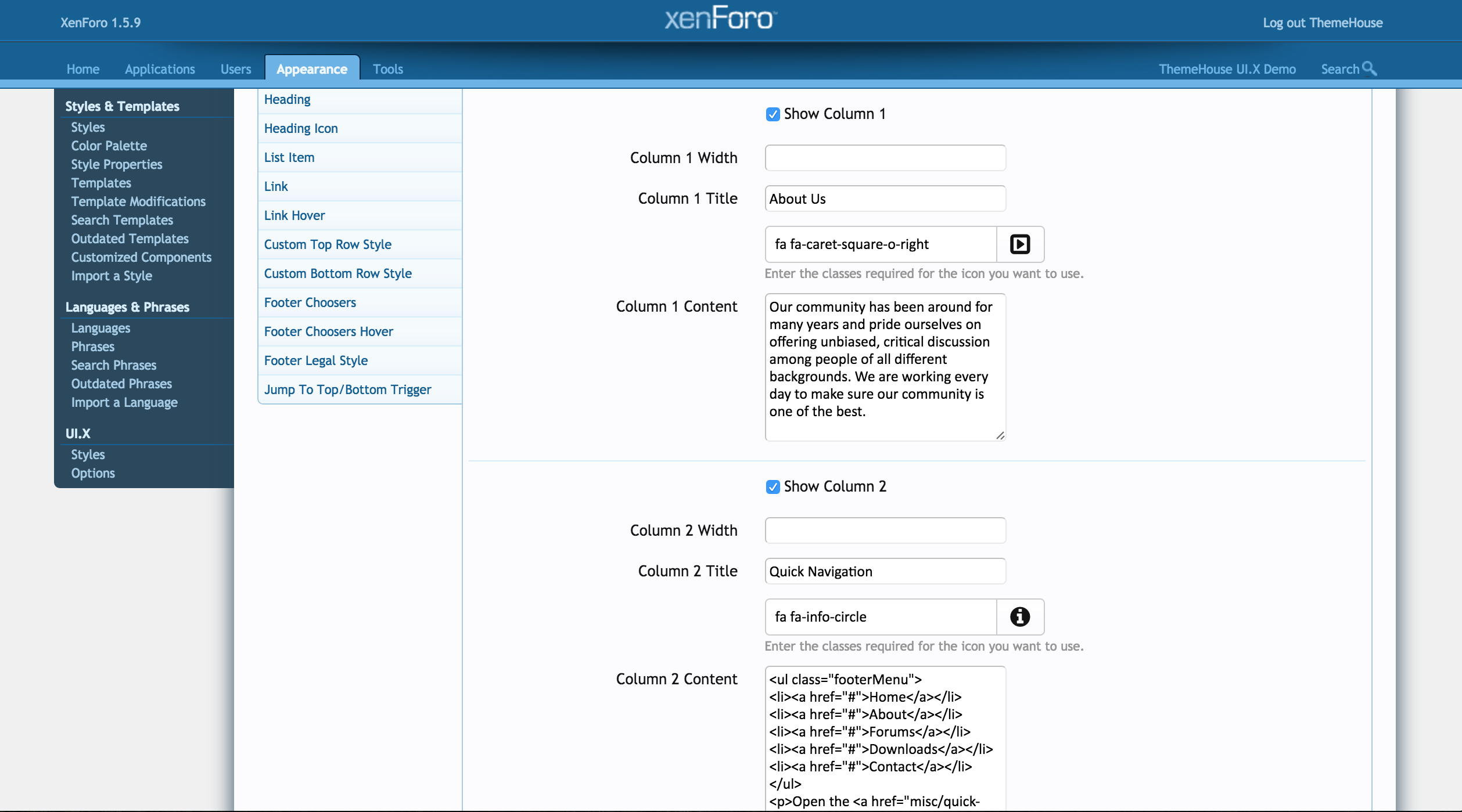
Enabling and Editing Your Extended Footer

Enabling Sticky Footer
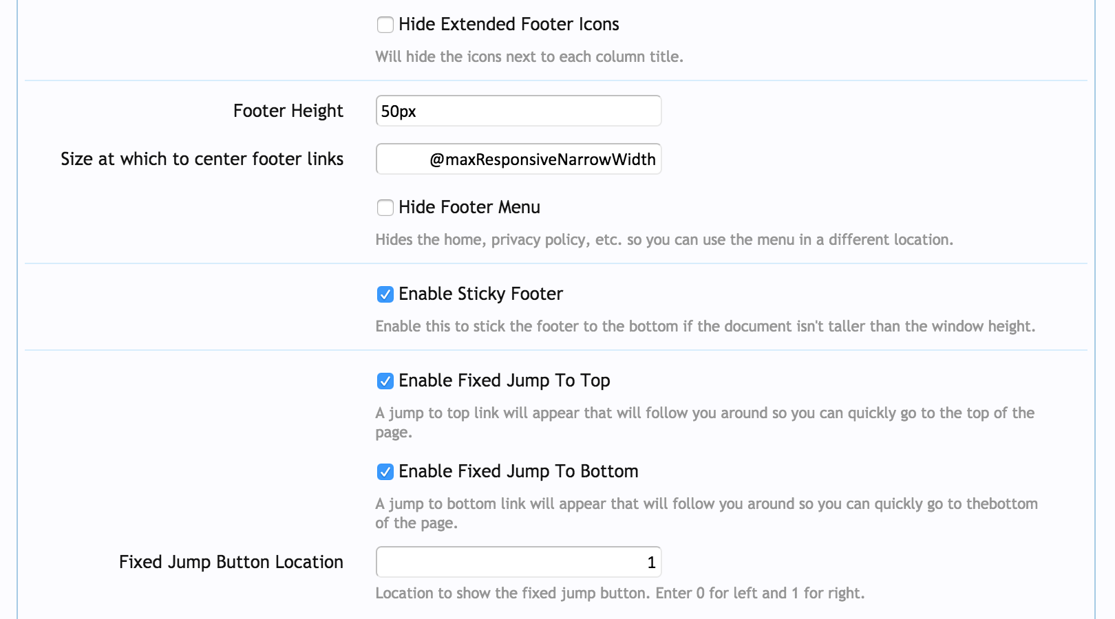
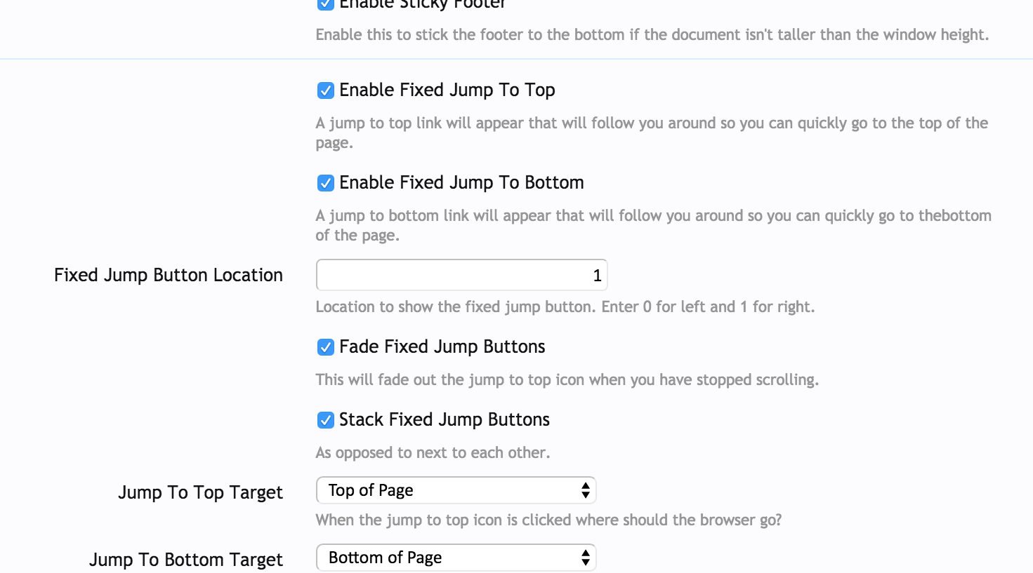
To enable sticky footer, go to Appearance > Styles > XenForo - UI.X > Style Property Groups > [UI.X] Footer and check the box next to Enable Sticky Footer. This will stick the footer to the bottom of your page as long as your document isn't taller than your window height.
Enabling your Jump To Buttons
Your jump to top buttons provide buttons in your bottom right hand corner as you scroll down the page.
To enable these buttons, go to Appearance > Styles > XenForo - UI.X > Style Property Groups > [UI.X] Footer and check the box next to the Enable Fixed Jumped to Top and Enable Fixed Jump to Bottom. You can move your jump buttons to the left by entering 0 into the Fixed Jump Button Location. Leave it at 1 to keep it on the right. Underneath this option, you'll also have the options to fade or stack these buttons. You can also choose where you'd like these buttons to go.
Social Media
Enabling Social Media Icons

Checked by default, this Social Media option will display graphic images linking to the Social Media sites specified. UI.X offers a huge range of Social Media sites and, while most sites will not use every single one, the most well known are represented here and simply require you to input the respective URLs to your site’s public facing account for each one.
To enable or disable these icons, go to Appearance > Styles > XenForo-UI.X > Style Property Groups > [UI.X] Social Media. Check or uncheck the box according to your preferences.
Changing the Appearance of Social Media Icons
To edit the appearance of these icons, go to Appearance > Styles > XenForo-UI.X > Style Property Groups > [UI.X] Social Media. Here, you can enable social media icons. The left hand sidebar lists the different social media elements where you are able to change their appearance such as color and size.
Adding a Social Media Account

In order for a social media icon to appear, you must have a URL entered in the social media account. To enter a URL for a social media account, go to Options > [UI.X] Social Media and enter your URLs in the allotted space.

As well as the external Social Media links, this section also offers you the ability to Show a Contact Link and RSS feed Icon for your site. These are checked by default. They display as an envelope and the commonly recognised RSS icon.


Welcome Section
Enabling Welcome Section


Enabling Welcome Section as a Modal

You can change your welcome section to a modal by going to Appearance > Styles > XenForo - UI.X > Style Property Groups > [UI.X] Welcome Section and checking the Welcome Section as Modal box.
Underneath this box, you will also see additional options for this modal. You can edit the position by changing the Welcome Modal Position value. Enter 0 for left and 1 for right. When a user chooses to close the welcome modal, you have the option to insert the content into the welcome section. To enable this feature, check the Insert Welcome Section Upon Closing Modal option. Your Welcome Modal's opacity can be edited with values from 0 to 1, 0 being no opacity and 1 being 100% opacity.

Advertisements


Preview Advertisements
You can let admins preview advertisement templates.
Go to Appearance > Styles > XenForo - UI.X > Style Property Groups > [UI.X] Advertisements and check Preview Advertisements.
You can also chose to center advertisements or remove content or sidebar advertisement wrappers by checking or unchecking the associated boxes in the Advertisments style properties.
Ad Styler

Our AD Styler offers personal customization for each of your members. This is perfect for communities that want to offer theme-related designs for holidays, sports, or games as examples, or just allow their users to change the look and feel slightly to each's own liking.
Turn Off the AD Styler


Navigate in your admin control panel to Appearance > Styles > XenForo - UI.X > Style Properties > [UI.X] AD Styler and then locate the setting Enable AD Styler. Toggle this off and you will notice all instances of the Styler will be removed including all links, images, and javascript. You can always turn it back on. Make sure to check your user permissions to ensure users have access to the AD Styler by going to Users > [Site Name] > User Permissions > [Audentio] UI.X Permissions.
Presets


Presets are custom theme-related designs that users can choose from in the AD styler.
To disable these presets, go to Appearance > Styles > XenForo - UI.X > Style Property Groups > [UI.X] AD Styler and uncheck the Enable AD Styler Presets.
Adding a Preset
After customizing your theme with the AD Styler, click the export button.
Once you click on the export button, a new window will appear asking you for a name.


Once you've saved your preset, upload the file to the server. Connect to the FTP and navigate to Xenforo Root > js > audentio > ad styler > [lastest version] > styles > uix. Drop your new preset in this folder.
Go back to your Xenforo admin and go to Appearance > Styles > XenForo - UI.X > Style Property Groups > [UI.X] Ad Styler. Scroll down and locate the input for presets. Add in your created presets name. The order the presets are listed in is the order the presets appear within the AD Styler's preset drop down menu. Click update style properties before continuing. Your new preset should be now be shown in the AD styler.
Swatches

This allows your users to quickly change to common colors. Pink, Blue, Orange, etc. and you can always add, remove, or edit these values in the color swatches template.
You can choose to disable this by going to Appearance > Styles > XenForo - UI.X > Style Property Groups > [UI.X] Ad Styler and unchecking Enable AD Styler Swatches.
AD Styler Colors

Your primary, secondary, and tertiary colors listed below are the colors that will be shown in the default appearance with AD Styler. Your users can always change these colors within the AD Styler.
To edit the default colors, go to Appearance > Styles > XenForo - UI.X > Style Property Groups > [UI.X] Ad Styler. Click the current colors shown and then chose a new color from the color properties.

Floating Notices
Changing your Floating Notices Location
To change the position of your floating notices, go to Appearance > Styles > XenForo - UI.X > Style Property Groups > [UI.X] Floating Notices. Enter 0 for left and 1 for right.

UI.X Helpers and Variables
UI.X Add-on Variables
$uix_isActive
- Type: Boolean
- Is the UI.X add-on active?
$uix_canCollapseSidebar
- Type: Boolean
- Does the user have permission to collapse the sidebar?
$uix_canViewWelcomeBlock
- Type: Boolean
- Does the user have permission to view the welcome block?
$uix_nodeLayouts
- Type: String
- JSON string of node layouts
$uix_nodeIcons
- Type: Array
- Array of the node icon cache
$uix_nodeClasses
- Type: Array
- Array of the node class cache
$uix_collapsedNodes
- Type: Array
- Array of the collapsed node cache
$uix_canUseStylerPanel
- Type: Boolean
- Does the user have permission to use the styler panel?
$uix_canUseStylerSwatches
- Type: Boolean
- Does the user have permission to use styler swatches?
$uix_canUseStylerPresets
- Type: Boolean
- Does the user have permission to use styler presets?
$uix_currentTimestamp
- Type: Unsigned Int
- The current timestamp.
UI.X View Template Override Variables
These variables have been created as overrides for disabling and enabling settings on a per view or template, ie PAGE_CONTAINER basis. There are two ways you can set these variables.
- Set the value of the variable to 1 in the view template using
- To hide the top breadcrumb on individual forum pages, insert
- Set the value of the variable to 1 in the Page Options of a page node using
- To set the sidebar to the left on an individual Page Node, insert
$uix_hidePageContent
- Comments out '.pageContent' and '.pageWidth' wrappers directly beneath '#content' for view.
- Notes: Typically used for heavily customized page nodes.
$uix_showWelcomeBlock
- Shows welcome block for view.
$uix_hideWelcomeBlock
- Hides welcome block for view.
$uix_hideTopBreadcrumb
- Comments out the top breadcrumb for view.
$uix_hideBottomBreadcrumb
- Comments out the bottom breadcrumb for view.
$uix_hidePageTitle
- Comments out page title for view.
$uix_hideNotices
- Comments out notices for view.
$uix_hidePageNodeContainer
- Hides (in CSS) 'share page' and 'page view count' on page nodes. Also gets rid of '#pageNodeContainer' padding.
$uix_disableNodeGrid
- Disables node grid layout functionality (not styling) on view.
Notes: Relevant for 'forum_list', 'forum_view', and 'watch_forums' view templates.
$uix_sidebarToRight, $uix_sidebarToLeft
- Sets sidebar location to the right and left respectively for the view.
Do not set these variables within the same template. For right-to-left languages such as Arabic these variables are not semantic, meaning that the sidebar actually appears on the opposite side as the name of the variable would suggest.
Setting Theme as Default
To set one of our themes as default, please follow these steps:
- Navigate to your Administrative Panel → Appearance → Look for the styles sidebar.
- The theme that is default is selected by a bullet. (Black for Windows/Blue for Mac)
- Select the theme you want as your default forum theme.
- Congratulations! You have now made your customized theme the default theme.

Help & Support
Stay in touch
In our newsletters we share strategies, tips, and inspiration to anyone involved in managing an online community along with updates, discounts, events, and other related information. We want to help build thriving online communities; not fill your inbox, so we typically only send 1-2 emails a month.