
Material
XenForo 1 Theme

There is no support for this product. We recommend testing first and backing up your install before moving to a production environment. Emergency support is not guaranteed if it is put on production. If you are in need of support, please contact us here. Support may be billable but we’ll be happy to take a look and provide a quote.
Material is a theme inspired by Google's Material design spec, whose purpose is to enhance legibility, be bold and intentional, and bring real life movement and depth to the web.
Built on the UI.X Framework, Material not only benefits from the styling control and functionality of its parent, but also builds greatly upon it, bringing new features to XenForo. Featuring a simple to use unique metro node styling system, you can bring your Node grid to life. Some of it's other great features include an extended color palette, a brand new off canvas menu, a beautifully re-designed member card, floating action buttons, and a free and extended copy of [TH] Covers add-on with coupon MATERIALCOVERS (add product to cart first!), with 4 additional user banner locations.
With it's bright bold colors, and perfected legibility, Material brings the best design spec of our age to XenForo.
This theme is powered by the UI.X Framework
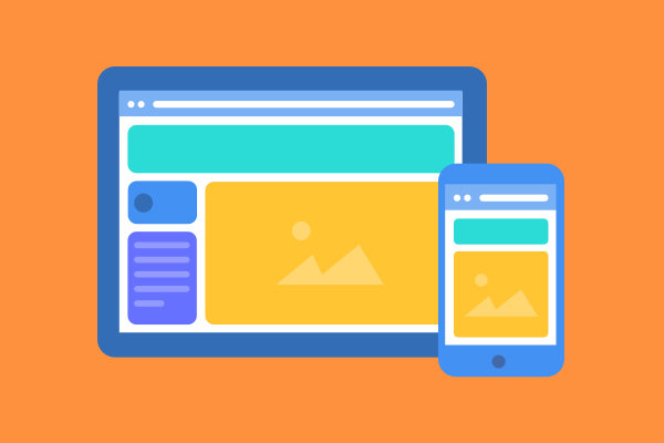
Ready for any screen or modern device, from mobile handhelds to tablets up to HD desktop with retina support.

Have some nodes better off in 3 or 4 columns? Some that you want full-width? Complete flexibility on giving nodes special widths for a truly custom look and feel on your index.
Lots of header and navigation customization tools such as background images, sticky navigation, navigation and logo styles, userbar for logged in users, and more.

Our UI.X framework has proved time and time again that it is the most powerful on the market and our over 5,000 customers agree.

Just about everything stylistic can be modified in the Style Property system, to allow quick theming and customization. Get up and running in no time at all.
FontAwesome by default can be added all over the places such as node status icons, logo icons, menus, and more. Material Icons and other icon sets can be added in as well.
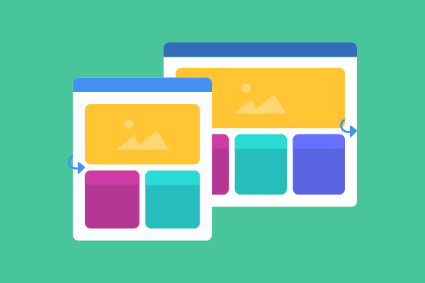
Allow your users to solve the age old question: fixed or fluid? Each user can choose their own preferred browsing page width.
It Doesn't Stop There
More Features
Install, receive upgrade notices, setup child/parent organization right from your control panel. Never miss an update.
Display a content-rich screen at all times and improve navigation usability and retention. Easily disabled individually by your users or can be removed globally.
For mobile or even desktop, you can display canvas panels on your site. Great for improving your navigation experience if you want to save space or just have a lot of links.
Add up to 4 columns and 3 rows to your footer for a small, concise footer or a link, call-to-action, widget filled huge footer. Works with Widget Framework and other add-ons as well.
Upload a logo, supports retina, use just text and an icon, an icon alone, and even move the logo to a few different places such as inside the navigation. Can also show a different logo on sticky navigation.
Allow certain usergroups to hide the sidebar for perhaps a bit more breathing room. Reset button TTL included as well.
Tired of seeing the same old sticky threads? Allow your users to collapse them if you choose. New response to threads, edited thread, and other criteria will automatically uncollapse them from hidden to visible for all users.
Help & Support
Stay in touch
In our newsletters we share strategies, tips, and inspiration to anyone involved in managing an online community along with updates, discounts, events, and other related information. We want to help build thriving online communities; not fill your inbox, so we typically only send 1-2 emails a month.
